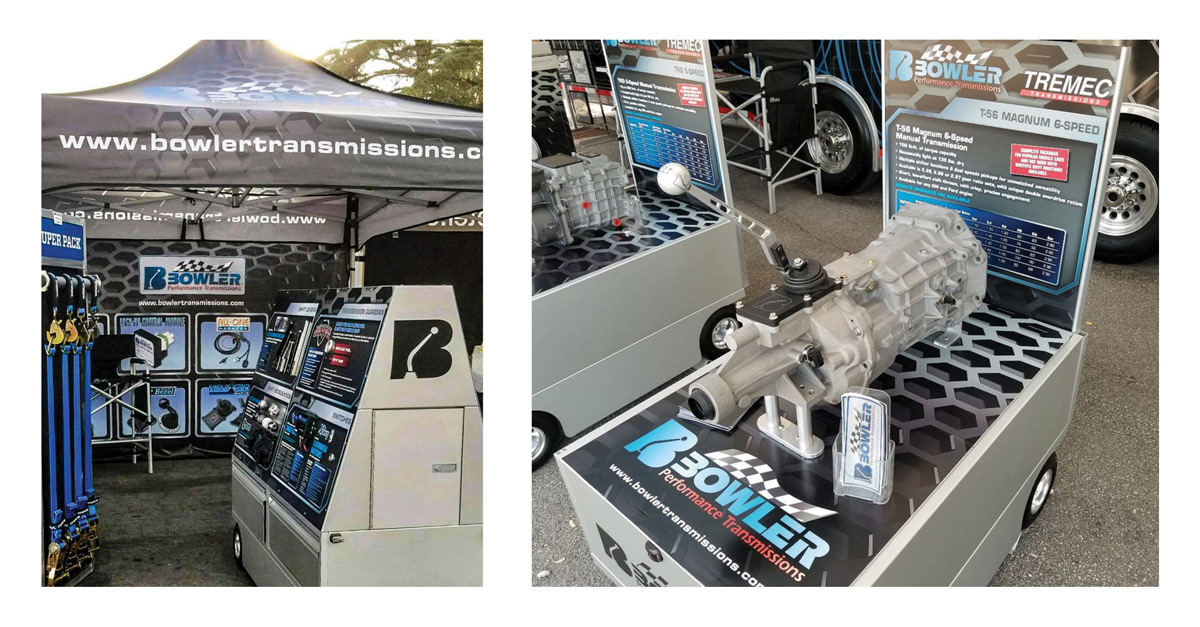
The logo design was created using Illustrator to make the logo versatile in every possible use within the brand. The slanted letters and waving checkered flag are designed to represent speed of the customers’ performance cars to which the client's products and services are designed. The shifter within the initial is representative of the transmissions and can be used as a stand-alone design element within the brand. The logo is combined with backgrounds and images that add a feel of speed and high-tech performance to enhance the brand on collateral and point of purchase items. InDesign was used to create the thirty-two-page catalog to take advantage of its master pages, page numbering, and typographic tools to ensure consistency on all sixteen spreads, while a variety of applications were used to create the point-of-purchase items.
Consistent colors, typestyles, and motion within the brand pieces ensure a consistent, appropriate, and engaging brand for the client's customers. Proximity is also used to help group and separate products on the pages of the catalog. Gradients are used to add depth and space to various elements, as well as to draw attention to specific ones, such as the logo medallion on the catalog pages. Research was performed on the nature of the transmissions and performance auto products to fully understand the products for accurate and effective promotion of the products to meet the client’s goals. Thumbnails were used to create six rough logo designs and a series of meeting ware used to finalize the logo design and other branded items that were provided as digital roughs for review.
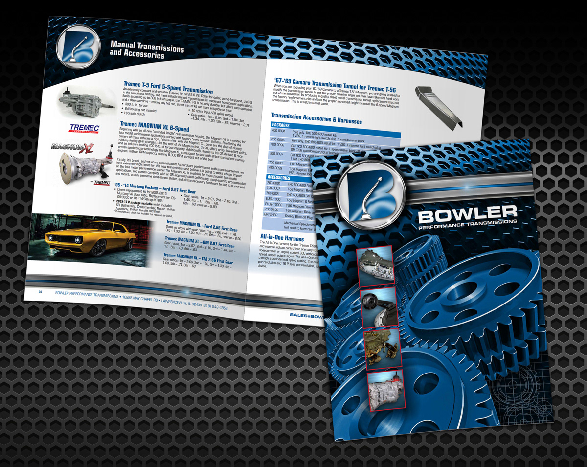
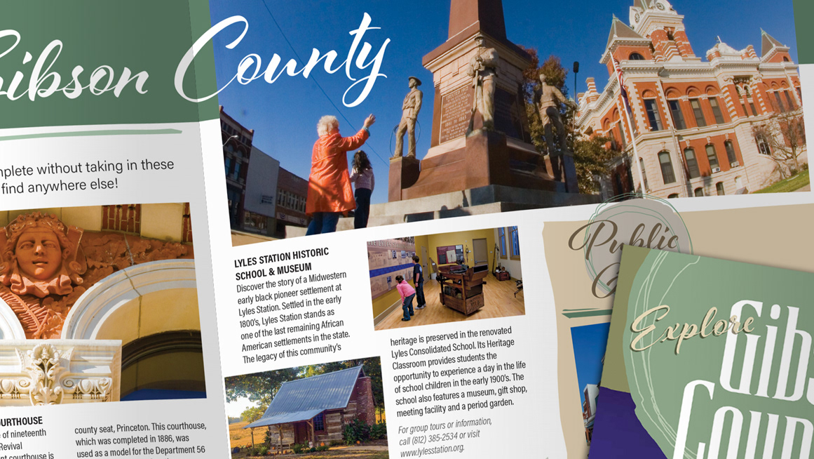
Product Catalog – 32 page, saddle-stitched