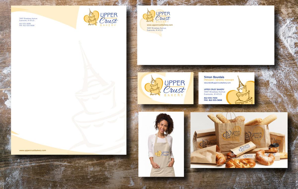
The logo for the brand is designed to suggest the old world charm of a French bakery through the Art Nouveau inspired type style and the Eiffel Tower as a cake topper. The logo is also meant to be friendly and causal with the script type and loosely drawn shapes. The heart reinforces this feeling of warmth and friendliness of the employees, as well as the love that is baked into the products. The warm tones add to this feeling, while the contrasting blue suggests reliability and trustworthiness. Curved wedges are used to provide a feeling of whimsy, while the horizontal line contrasts the curves. Proximity helps unify the type and graphics. The logo is used consistently throughout the brand with elements of the heart and cake topper being used as design elements to add variety and interest to the brand.
The logo was created in Illustrator to utilize the scalability of vector graphics in all aspects of the brand and to make it possible to create the custom graphic. Illustrator was also used to create the stationery design, while Photoshop was utilized to create mockups for the apron, packaging designs. Research into bakery branding was performed to allow the creation of a dozen thumbnails for the logo, which were critiqued and then narrowed down to four rough layouts. More feedback suggested three variations of the final design from which to ultimately choose the final version. Feedback was also provided on the stationery before it was finalized to help make a stronger brand concept by helping choose the strongest, most simple design.