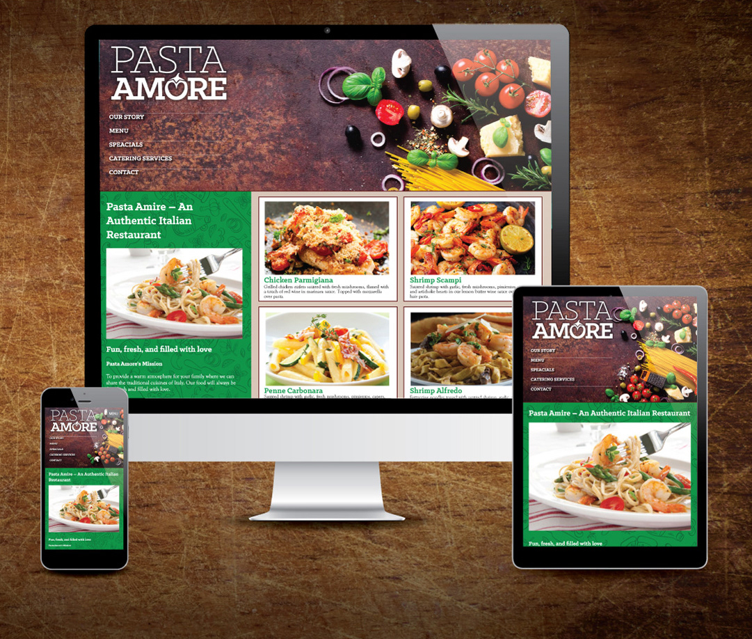
Pasta Amore is an Italian restaurant that combines the cooking traditions and ingredients of Italy with creativity, providing a modern twist on timeless classics. The goal of the project was to use their existing brand, which consisted of a logo, color scheme and fonts, to create a menu, small brochure to promote the restaurant's catering services, table tent promoting the weekly specials, and website. Images of Italy and fresh ingredients used in the menu items are important to communicating the quality of their traditional Italian dishes. A script typestyle is used to add a personal, family feel to the designs.
Shape is very important to these designs, which rely on contrast between organic food ingredients, rectangles and circles to add visual interest. Rectangular shapes, along with grids, are used to differentiate elements and to organize the space. Emphasis is placed on images of the beautifully prepared food dishes to whet the appetites of the viewers, and contrast of weight is used on the type to make it more functional. Color is used in a bright and cheerful manner to communicate the idea of Italian food on the brochure, but it is toned down to create a more sophisticated appearance for the menu in the restaurant setting. Brighter colors are again used on the table tent to get it noticed on the restaurant’s tables. Simple line drawings of Italian food items and ingredients create texture in the backgrounds for depth and visual appeal.
InDesign was used to create the print items due to its advanced typographic and page layout tools, as well as its ability to work with multiple page projects that ensure consistency between margins and columns of each page with master pages, along with paragraph and character styles for type consistency. Colors and typography were also kept consistent between the different layouts by sharing fonts, styles and colors in all documents. The website was designed using Illustrator and built with HTML and CSS coding. Photoshop was utilized to create mockups for a more photographic and dimensional appearance. Time was spent researching imagery for possible styles and themes for an Italian restaurant. Thumbnail sketches were produced before rough layouts were created to explore different possible layouts and styles before choosing the final theme. This research, ideation and planning at the early stages led to a more polished and professional final design.
Cover and sample spread of the 8-page menu

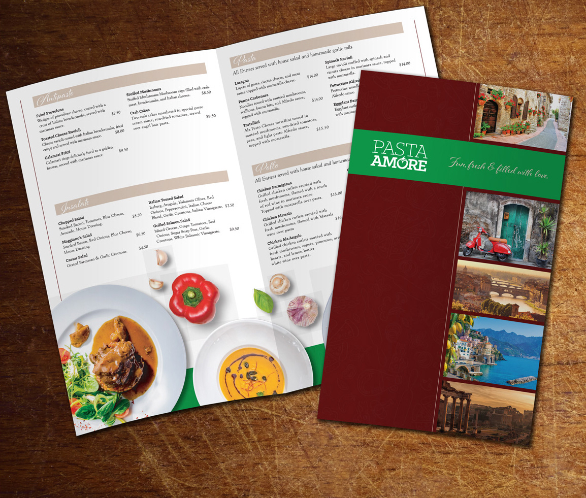
Cover and inside spread of the catering brochure
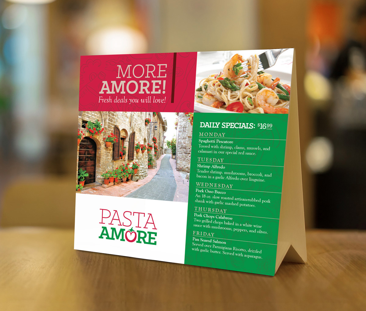
Table tent design promoting the weekly specials