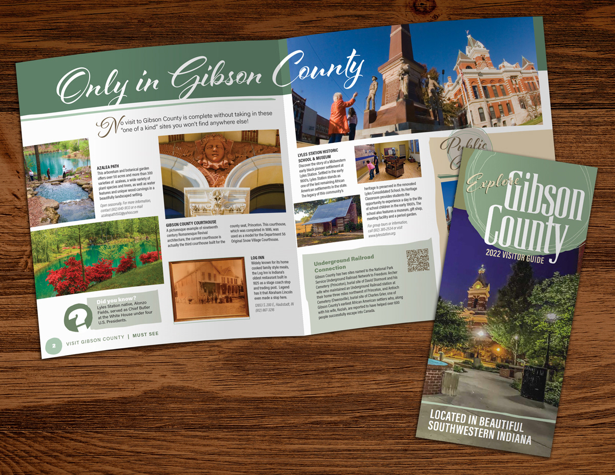
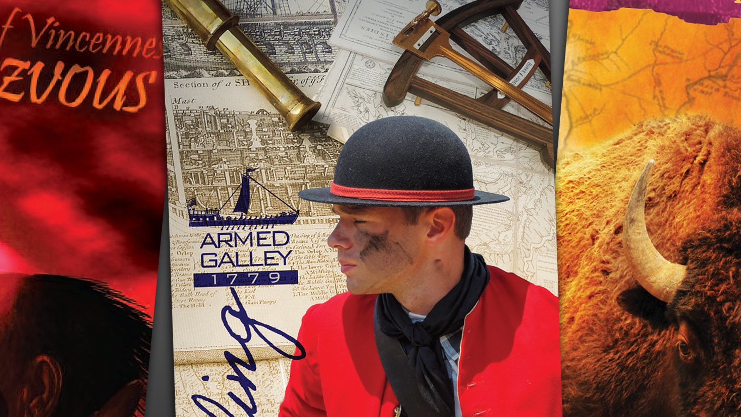
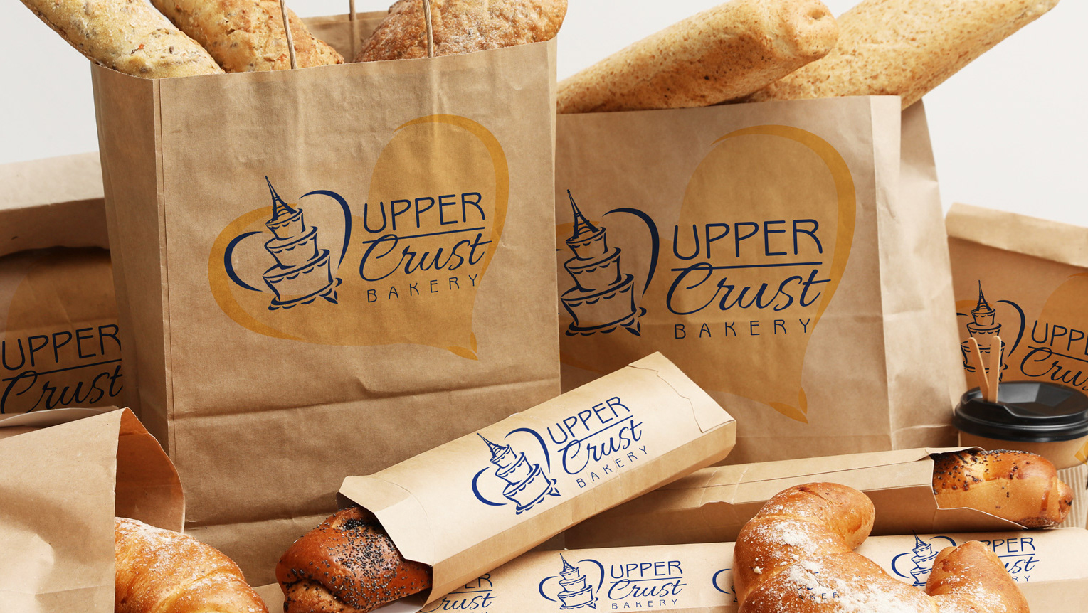
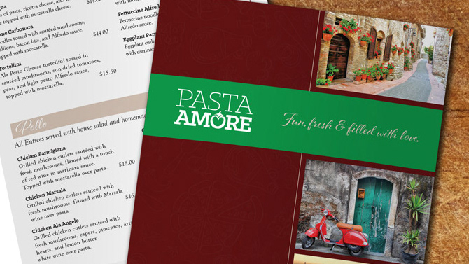
This visitor guide consists of ten two-page spreads to provide an overview of the county for potential visitors. Rustic, irregular shapes were chosen for graphic elements within the pages to add a causal and playful feel to the design. Semi-neutral earth tones were also used to provide a comfortable and inviting feel. White space was used to contrast with the colors in the images and graphics, as well as to provide good value contrast for increased legibility of the type. The space is intentionally full to make it seem that there is a lot to do and see within the county. A grid system is used to organize the elements and provide unity in the layout along with the use of similar shapes throughout. The type elements are also meant to feel playful by breaking out of their boxes in certain locations and through the cursive style. Emphasis is kept on the images to entice them to visit the locations.
InDesign was used to take advantage of its ability to easily work with multiple page documents, master pages to control margins, columns, bleeds, slugs, and automatic page numbering in the folios. Paragraph and character styles were also used to keep the type consistent, while color swatches did the same for the colors and values.
A series of meetings with the client helped generate concepts and directions for creating this design. Several rough layouts were created for client review before all parties involved decided on the final direction, then a number of additional layouts were created and reviewed by the client for approval of revisions throughout the process of finalizing the document.
