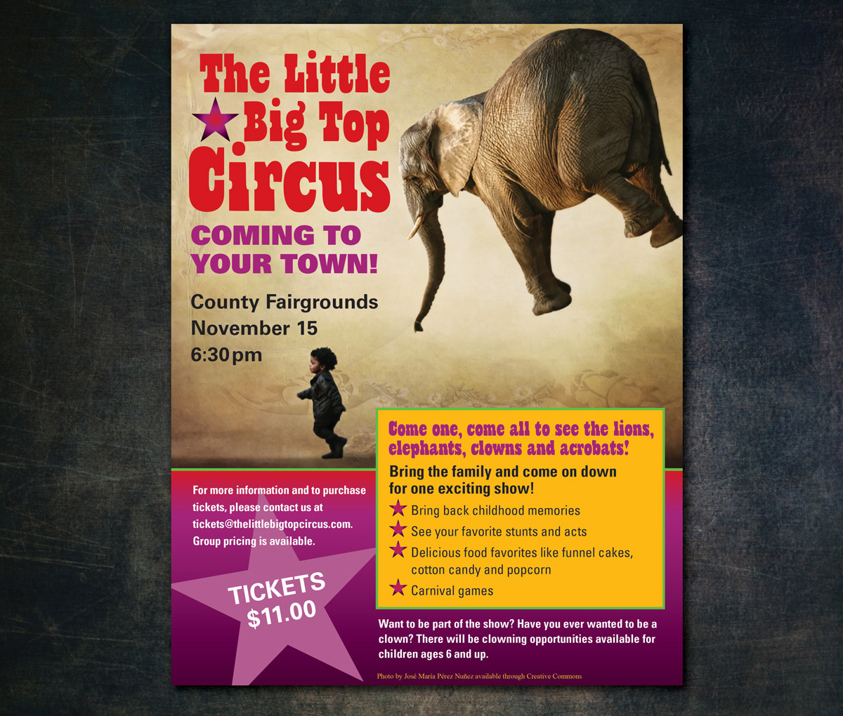
This poster design is intended to promote an event for The Big Little Circus, who provided the image. Illustrator was used to take advantage of its ability to work with type and simple graphics. Repetition of color, shape and typestyle was used to unify the design, while the angle of the bottom star and the floating elephant add variety and contrast. Contrast of color and value was also used for variety and to make the type easy to read. Negative space is used under the elephant to reinforce the idea that it is lighter than air. The linear motion of the child running to the left was used to lead the viewer’s eye back toward the type and event’s time to help balance. The larger star in the bottom left counters the weight in the upper right corner. Counter balancing the headline with the yellow text frame mirrors this diagonal balance.
The process of designing this ad began with experimentation of placement of the unusual content of the image within the space and its relationship with the main headline before settling on this solution. The original version was critiqued and typography and content were revised to simplify and strengthen the design.
