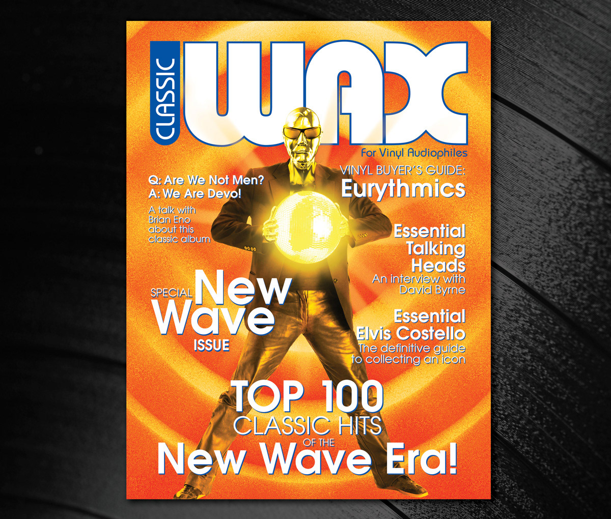
A combination of Illustrator and Photoshop was used to create these layouts to meet the challenge of utilizing the same image for two very different publications. Photoshop was used to composite the separate images of the robot, mirror ball, and sunglasses. The backgrounds were also created in Photoshop using filters and effects. The final layouts were assembled in Illustrator for greater control of the typography. Similar styles of type are used within each design to unify the type elements and were chosen to suggest the topic of each magazine. Emphasis is created by used contrasting type sizes and weights. Centering the figure, framing it with type, and using the nameplates large at the top of the design space achieved the main focal point in each design of the mirror ball, figure and magazine nameplate. Colors and value contrast were also used to reinforce the topic of the magazine and promote better legibility of the type.
Considerable time was spent on finding an image that would lend itself to multiple interpretations, along with researching magazine covers to ensure the proper use of type, color, value, and space were accurate and functional. Feedback to correct the initial low-resolution public domain image was implemented by using to royalty free images to correct this issue and maintaining the original concept. The compositing of the new images in Photoshop required extreme attention to detail to ensure the final composite was seamless in appearance.
