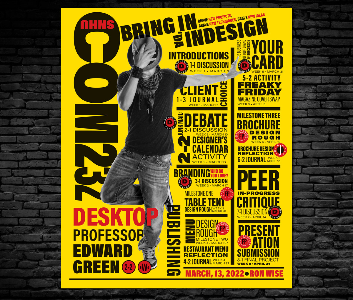
This calendar design captures the fun energy of Paula Scher's famous design for the Public Theater by mimicking her bold use of color, overlapping image elements, variety of type weights, and alignments. The calendar is designed using InDesign to be a design class weekly calendar with icons representing different weekly activities in addition to the type listings.
Rhythm was established within the type by switching between text sizes within each calendar item and repeatedly using touches of red and the circular shapes at consistent intervals. Emphasis is created through exaggerating the size of the main headline along the left side and using the large figure next to it. Using the subhead at an angle emphasizes it and adds a feeling of motion, along with the progressive change of wide to narrow type in the headline to draw the viewer’s eye down into the design. Overlapping type on the image and the image on the type creates unity.
The blocky type and simple colors, as wells as the rhythm of alternating type sizes, were used successfully to create a poster that refers to the original. Self-assessment of the design was relied on for making improvements to make it more successful. The process of copying the style of such a well-known and talented designer required paying close attention to the details of the type and layout, such as unifying type alignments and ensuring it has proper emphasis and variety.